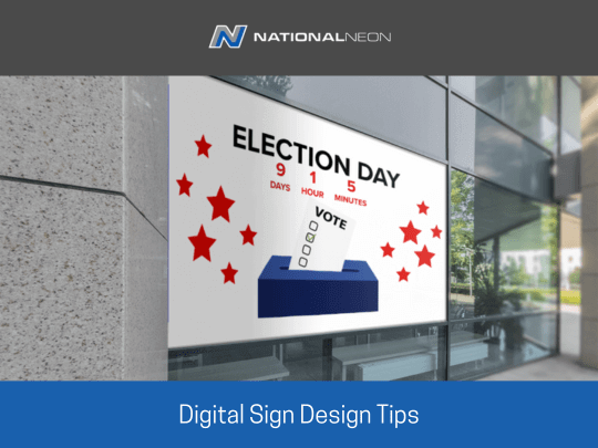
Designing digital signs has a bit of a learning curve – but with these tips, you will be a pro in no time!
Make a plan
First and foremost, you need to consider the purpose of your sign. What do you want to say? How, where and when will it be used?
Make it easy for audiences.
Once you have a clear idea of your sign’s goal, you can start thinking about the design. Keep it simple – too much information will only confuse people. And make sure the sign is easy to read from a distance.
Call to action
Consider making a clear call to action on the sign. What do you want people to do? For example, ‘Come to our store’ or ‘Like Us on Facebook’.
Colour
Use colours wisely – fewer colours will make your sign clearer and easier to read. Stick to two or three colours maximum, and use high-contrast colours for easy viewing. Meaning, don’t put yellow font on a white background.
High-contrast colours can help your display grab attention, even from a distance. This can be especially helpful if you’re trying to catch the eye of passersby.
Text styles and font size
Same goes for font styles. Use simple, legible font styles. Avoid complex or over-designed fonts, and choose a text size that can be read from the road. Your sign should be visible even when driving past at high speeds.
Keep motion to a minimum.
Animation is a valuable and entertaining tool for digital signage displays. However, reading text with moving elements, such as scrolling or bouncing text, is difficult and can distract from multiple moving elements at once. You want it to draw attention, not distract viewers with unnecessary motions. A little here and there is fine, but don’t overdo it. Especially if you’re trying to catch the attention of people driving.
Keep updating the content.
You should update content regularly and refresh frequently. Frequent updates keep the value that the sign provides your business high.

