Your business sign has a big job to do. It needs to attract attention, help customers find your location, and reinforce your brand identity at the same time. One of the best ways to improve your sign’s visibility and make a stronger first impression is to illuminate it. Illuminated signage helps your business stand out and ensures your sign is easy to see and read, even after dark!
But how exactly can signs be illuminated? There are several methods available, each offering different styles and benefits. In this article, we’ll look at some of the most common ways you can illuminate your sign.
What is illuminated signage?
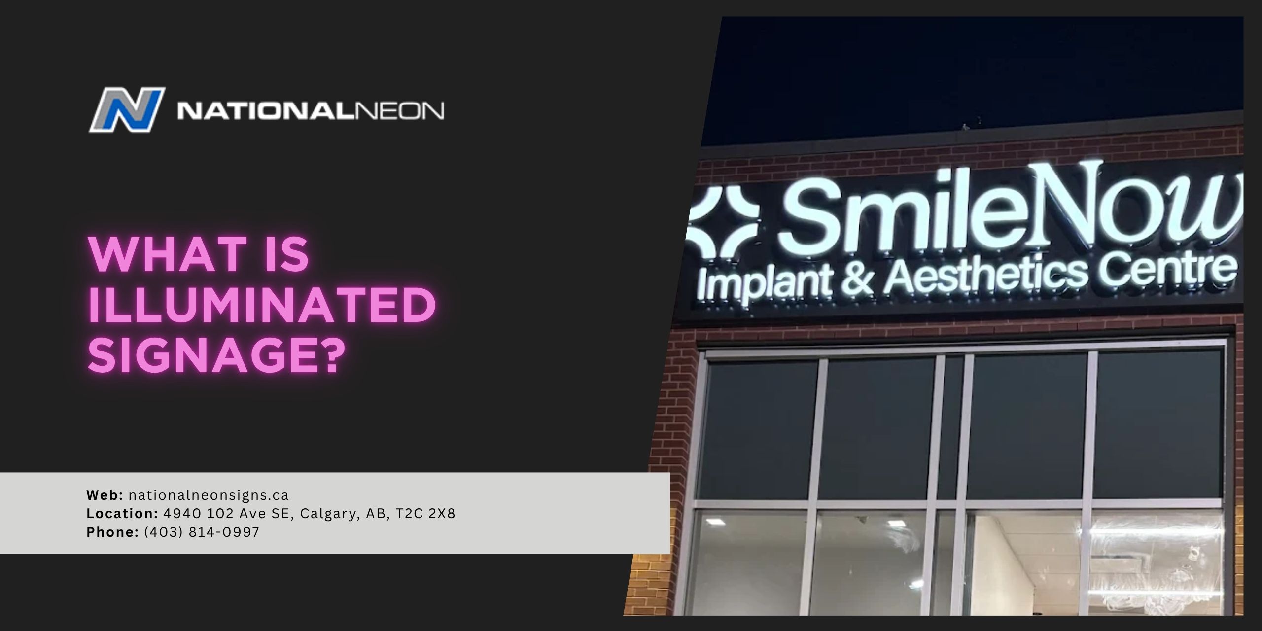
Illuminated signage is any sign that uses lighting to improve its visibility and readability. Visible around the clock, illuminated signs are considered one of the best effective forms of long-term advertising, and are used by businesses of all sizes.
How can signs be illuminated?
Signs can be illuminated in several different ways, depending on the desired look, brightness, and functionality. They can be lit using internal light sources like LEDs or neon, or via external lighting like spotlights or floodlights.
Internal Illumination
These are some of the most common types of internal illumination, where the light source is built directly into the sign itself:
1. LED Illumination
LED (light-emitting diode) lighting is the most popular choice for modern illuminated signage. LEDs are energy-efficient, long-lasting, and versatile, making them suitable for many different styles and applications, including:
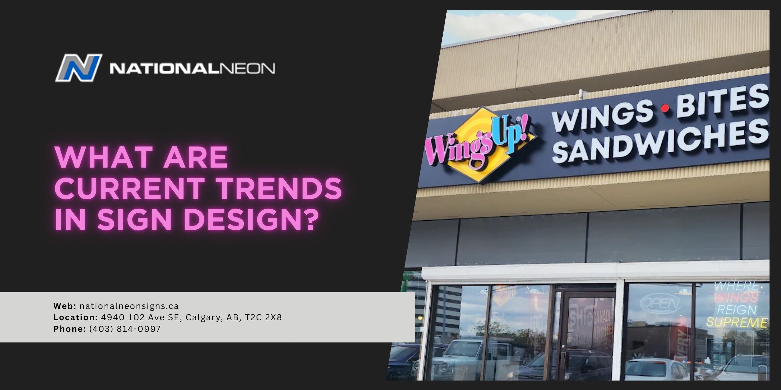
- Channel Letter Signs: LEDs are commonly used in channel letter signs, where individual, three-dimensional letters are illuminated for a bold, professional appearance. These signs can be front-lit, back-lit (halo-lit), or both, depending on the desired effect.
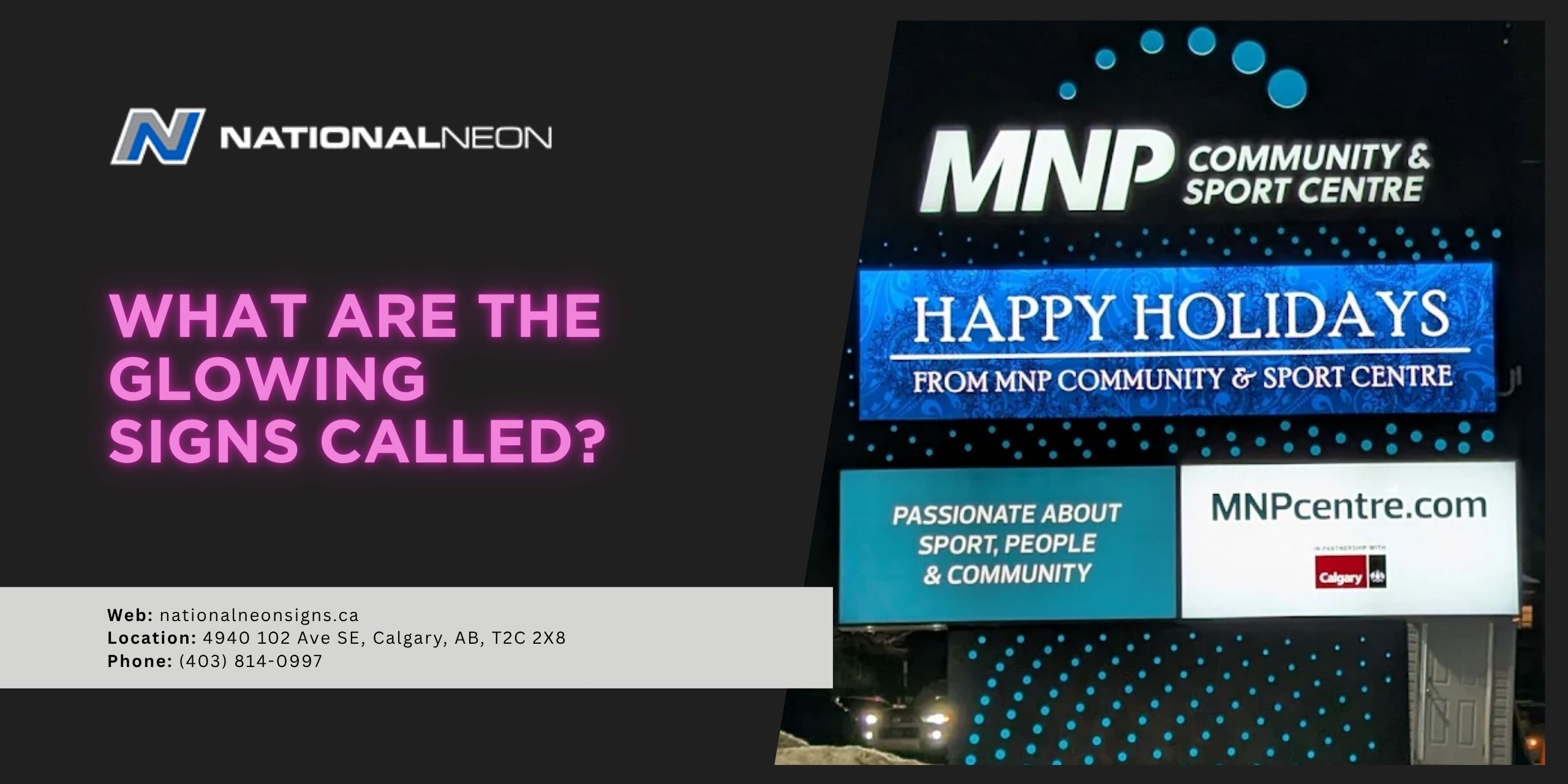
- Light Boxes: Light boxes, also known as cabinet signs, use LEDs inside the sign structure to illuminate the face from within. The result is a bright, glowing display that is highly visible both day and night.
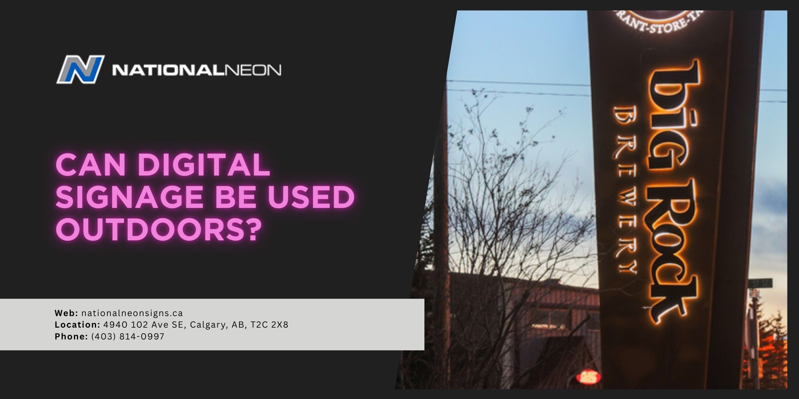
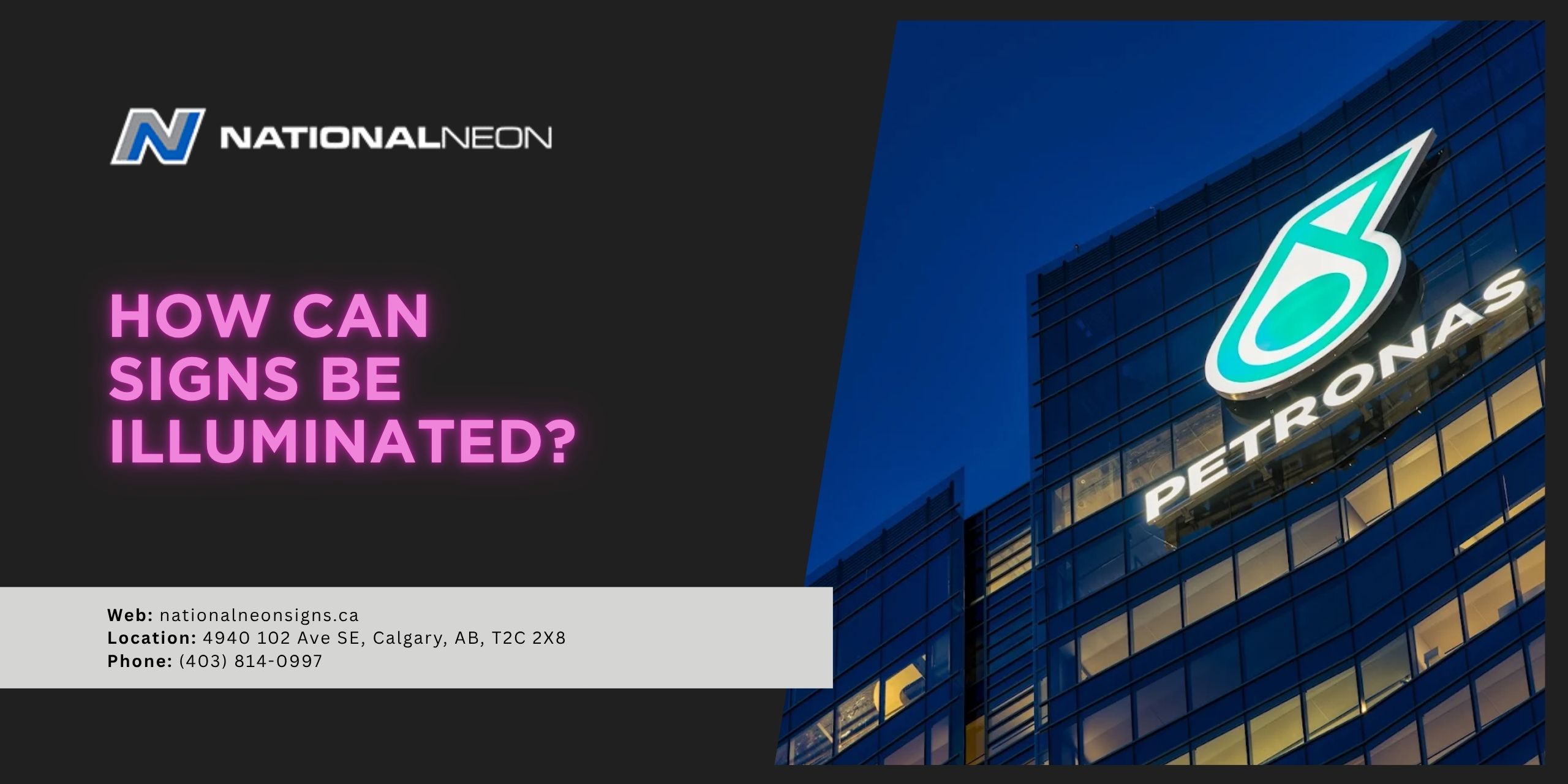
- Halo-Lit Signs: Halo-lit signage is a style where light is projected from behind the sign to create a soft glow or “halo” effect around the letters or design. Imost commonly used in channel letters, though it’s not limited to them. This lighting technique can also be applied to dimensional logos, brand panels, or other custom shapes for a modern, high-end appearance.
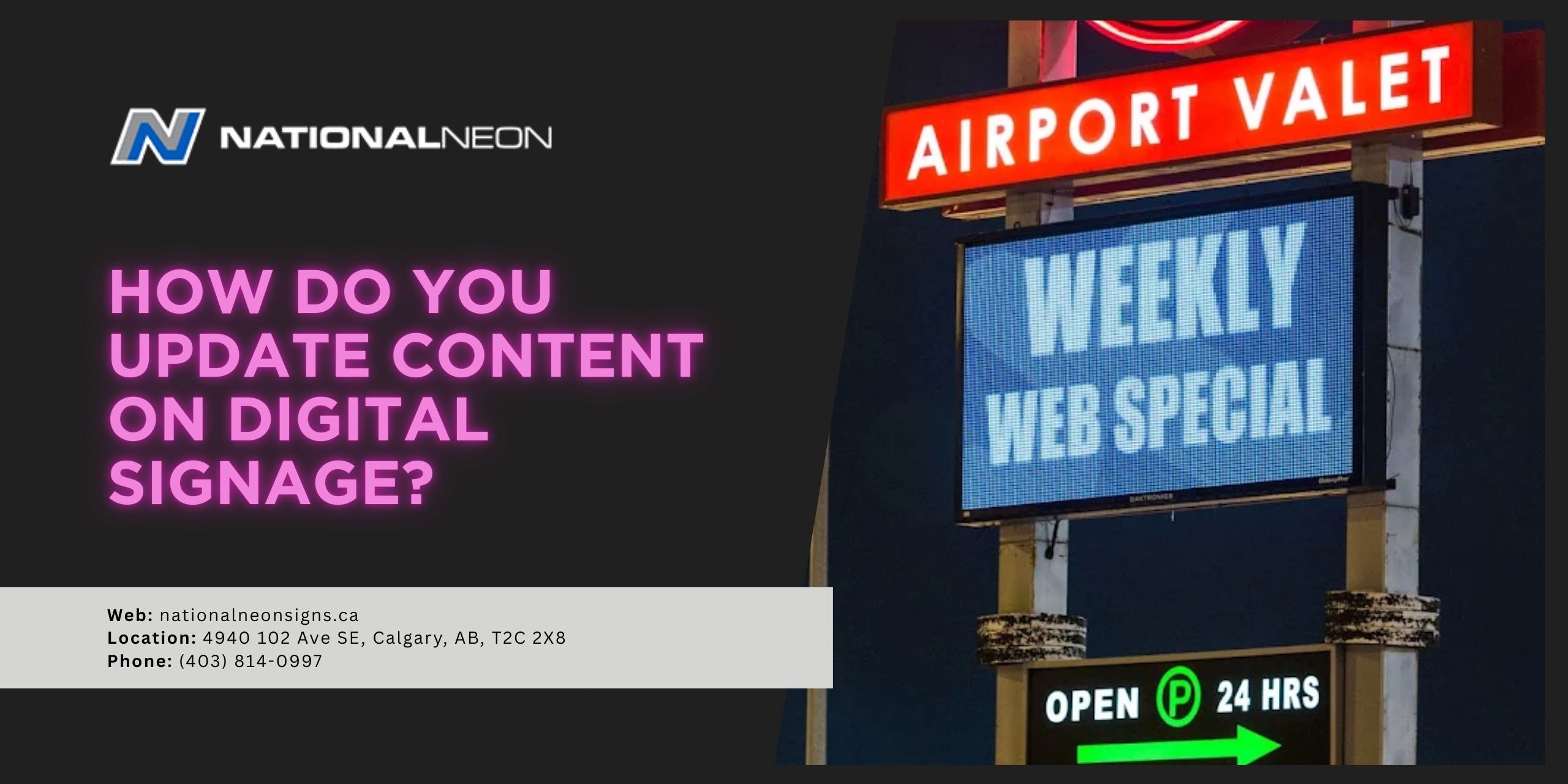
- Digital Displays: Digital signage is a modern extension of LED illumination that uses LED screens to create dynamic displays. Instead of static signs, businesses can update their messages or rotate content in real time.
2. Neon Illumination
Neon signs have been used for decades and remain popular for their warm glow and nostalgic appeal. Traditional neon signs use glass tubes filled with gas that light up when electricity passes through them. Neon signs are often used by businesses such as:
- Bars and pubs
- Diners
- Entertainment venues
- Vintage-style businesses
While authentic neon signs are still available, many businesses now choose LED neon alternatives, which offer a similar visual effect while using less energy and requiring less maintenance.
External Illumination
In addition to internal lighting, signs can be illuminated externally using fixtures that direct light onto the face of the sign, such as:
1. Spotlight Illumination
A spotlight produces a narrow, focused beam of light that is directed at a specific point. It might be used to highlight a particular sign, logo, or feature where you want concentrated illumination.
2. Floodlight Illumination
A floodlight, on the other hand, produces a wide, broad beam of light that spreads over a larger area than a spotlight. It might be used to illuminate a bigger surface like a monument sign, building facade, or large outdoor signage.
3. Gooseneck Lighting
A gooseneck light is a more decorative type of external lighting, with a long, curved arm shaped like a goose’s neck, hence the name. It is typically mounted above a sign and casts a soft light downward onto the sign face.
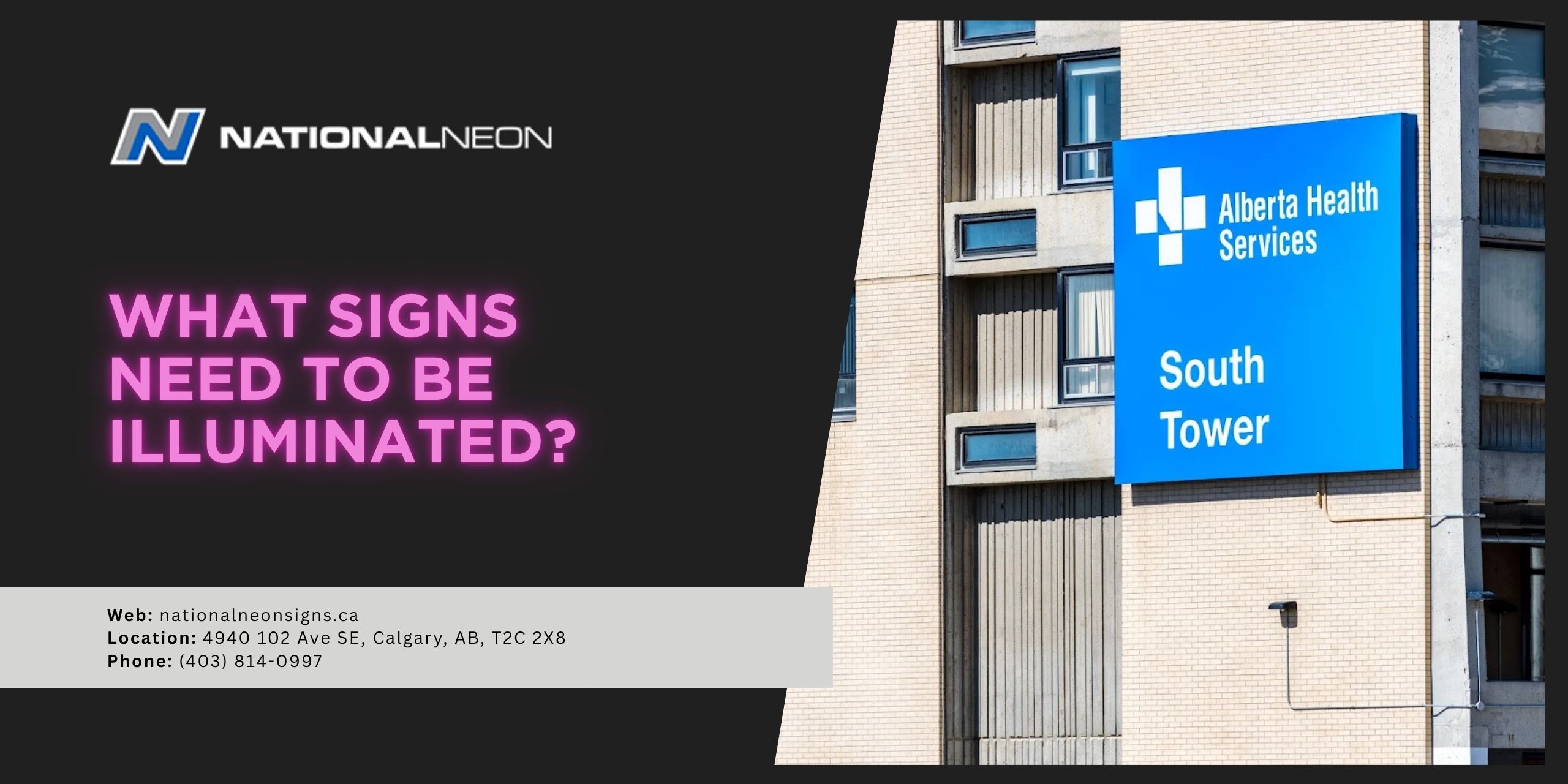
Do illuminated signs require a permit?
In most cases, yes, illuminated signs require a permit before installation. Because they involve electrical components and are mounted onto public-facing spaces, they are typically regulated by local municipal bylaws and building codes. Requirements can vary depending on the location and type of sign, so it’s important to check with your local municipality or work with a professional sign company to ensure all permits are properly obtained before installing your illuminated sign.
There are many ways signs can be illuminated, and each method offers unique visual and functional benefits. If you’d like more information on choosing the right sign for your business, contact us today at National Neon to get started!