In the grand scheme of things, fonts might seem like a small detail. However, when it comes to digital signage, they’re often overlooked—even though they play one of the biggest roles in making a message connect.
Business owners often ask: What is the best font for digital signage? The answer goes beyond style. Readability, visibility, and alignment with your brand identity should always come first.
At National Neon Signs, we help Canadian businesses design eye-catching yet effective signage. In this guide, we’ll explore which fonts work best, mistakes to avoid, and how to choose typography that makes your signage shine.
What Makes a Font Effective?
Some fonts aren’t designed with large-scale visibility in mind. The best fonts strike the perfect balance between aesthetics and practicality. Keep the following tips in mind:
- Readability: Opt for clear, simple fonts that are easy to read a glance—whether someone is walking past your storefront signage or scanning a digital menu.
- Scalability: A strong should look as great on a small screen as it would on a large outdoor display.
- Contrast & Weight: Bold fonts stand out against bright or busy backgrounds. Balance is key to ensure your message pops.
- Brand Consistency: Fonts should reflect your brand. For example, a modern tech company may prefer a sleek sans-serif, while a boutique shop might choose a font with more character so long as it remains legible.
When it’s time to choose a font, you should choose one that’s adaptable. It will let your message stand out no matter the sign.
Popular Font Choices for Digital Signage
As the years pass, some fonts tend to work better than others. There are few categories of fonts that make the most sense for digital signage:
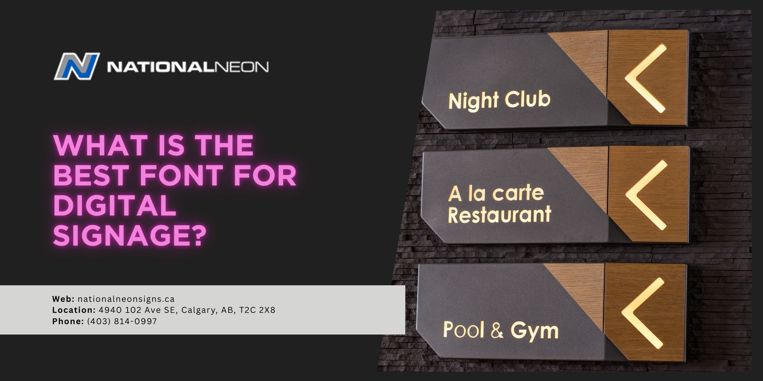
- Sans-Serif Fonts (e.g Helvetica, Arial, Open Sans): They are clean, modern and highly legible from a distance. This makes it ideal for multiple applications that range from indoor menus to outdoor billboards.
- Slab-Serif Fonts (e.g. Rockwell, Roboto Slab): By using thicker strokes, slab serif fonts offer a combination of strength and visibility while adding a touch of personality to your signs.
- Custom Fonts: Using a unique, branded font is the best way to make your signage stand out as long as legible. If it’s too thin or ornate, it might hurt visibility rather than help.
We find that many of our clients combine a sans-serif font for main messaging with a complementary secondary font for accents. The style looks great without sacrificing clarity.
Mistakes to Avoid When Choosing a Font for Your Digital Sign
Creativity is great! However, it has its limitations. Here are the common pitfalls to avoid:
- Overly Decorative or Script Fonts: While they might look stylish up close, such fonts can be nearly impossible to read from a distance.
- Thin or Light-Weight Fonts: Be careful because fine lines tend to disappear against bright light or from far away.
- Too Many Fonts on One Sign: You shouldn’t mix too many fonts. When you have three or more fonts on a single sign, it can lead to visual confusion and clutter.
- Poor Colour Contrast: The font should not blend into the background of your sign. Always prioritize strong contrast for maximum legibility.
Not getting the font wrong is just as important as getting right. By avoiding these mistakes, you can easily get your message out to the world without issue.
Choose the Best Font for Your Signage
What is the best font for digital signage? While it can vary based on your brand application, the winners are always clear, bold and easy to read. Sans=serif fonts like Helvetica or Arial are classic, but slab serifs add personality. At National Neon Signs, we believe your font should support your message, not distract from it and should be made from a professional sign maker in Canada. That’s why we’ll work with you every step of the way.
Ready to create signage that looks amazing and gets results? Contact us to schedule a custom consultation!