In today’s competitive market, visibility matters more than ever. We live in a world with endless signs, advertisements, and other visual distractions, which are all competing for our interest, and one of the most effective ways for companies to attract attention is through illuminated signage. From glowing storefront logos to dynamic digital displays, illuminated signs help businesses stand out day and night.
But what exactly is illuminated signage, and why is it such an essential marketing tool? Keep reading to find out.
What is illuminated signage?
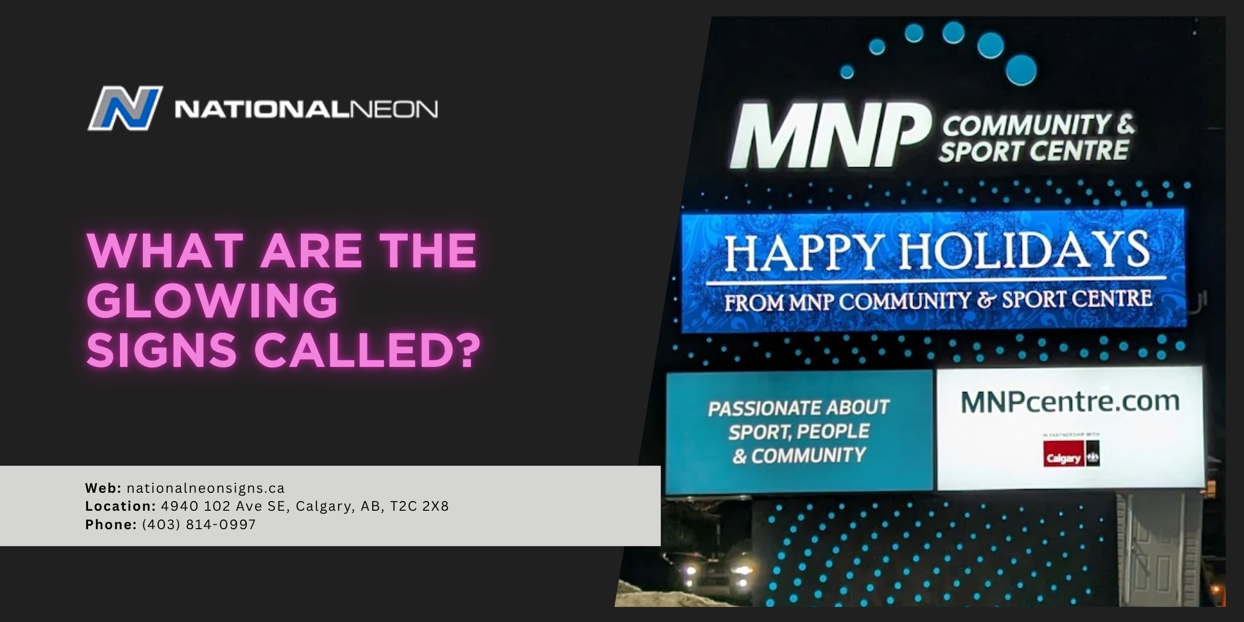
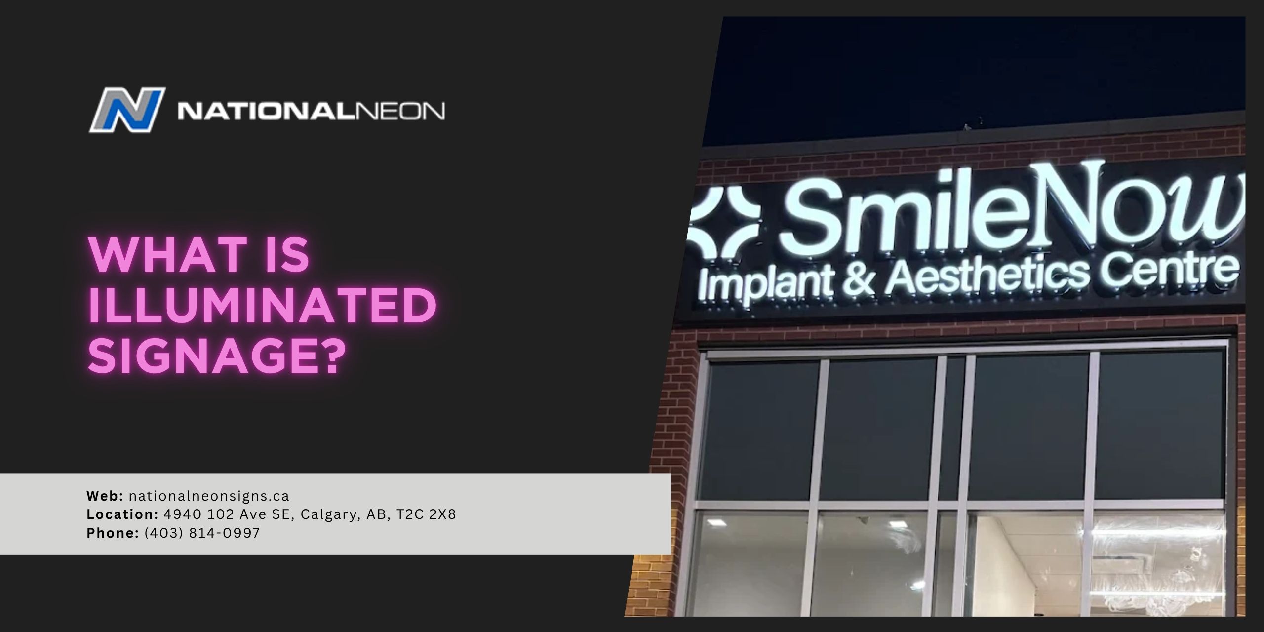
Illuminated signage refers to any type of sign that uses built-in lighting to improve visibility. These signs can be lit in several ways, including internal lighting, backlighting, edge lighting, or digital displays. Most modern illuminated signs use LED technology due to its high energy efficiency and durability.
Illuminated signage combines design and lighting to create eye-catching displays that help businesses communicate more effectively with their customers. They are commonly used by restaurants, retail stores, entertainment venues, hotels, or office buildings. Because illuminated signs remain visible around the clock, they are often considered one of the most effective forms of ongoing business advertising.
What are some common types of illuminated signage?
Illuminated signage comes in a wide range of styles, each designed to serve different branding and advertising needs. Some common types include:
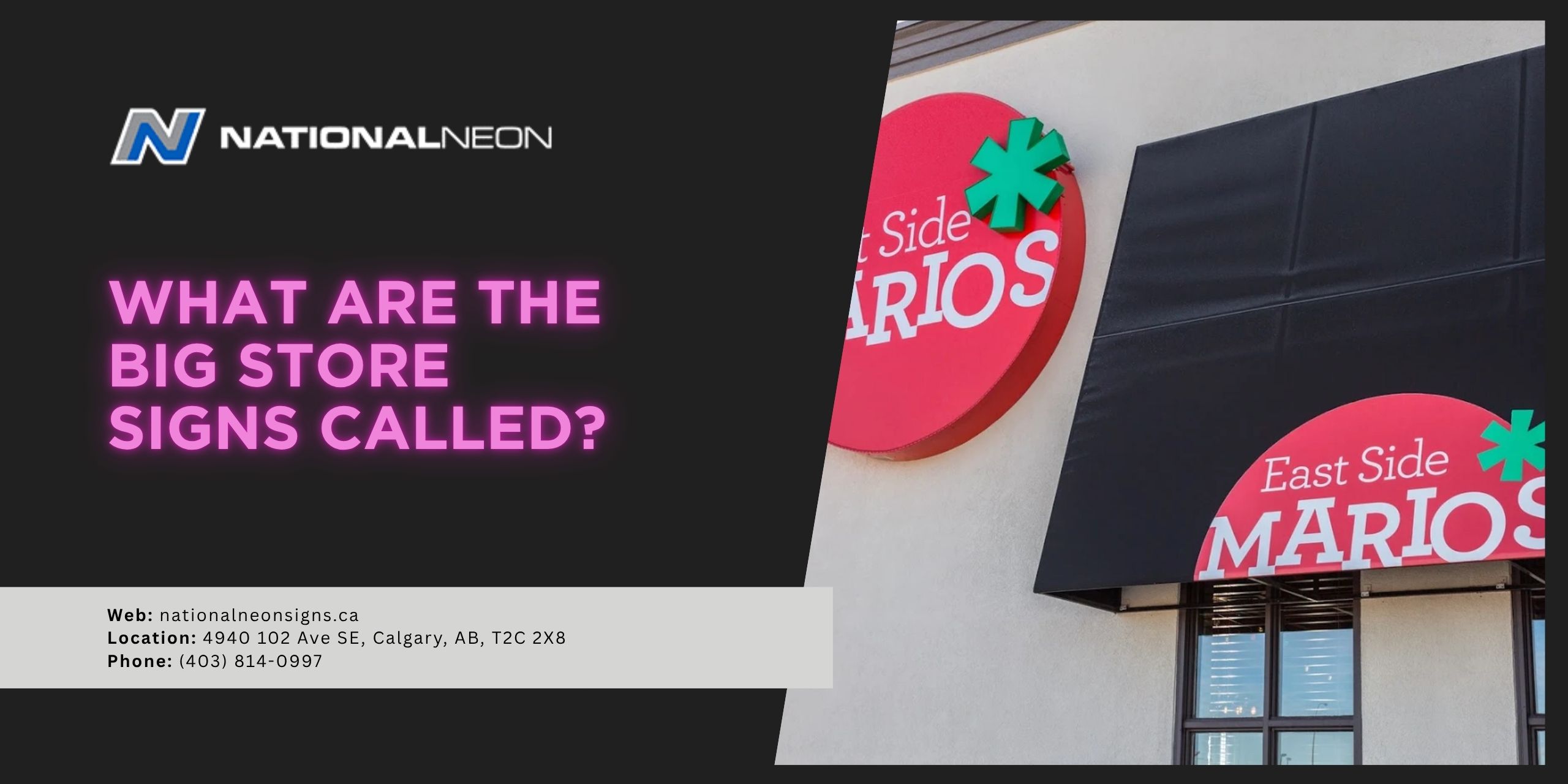
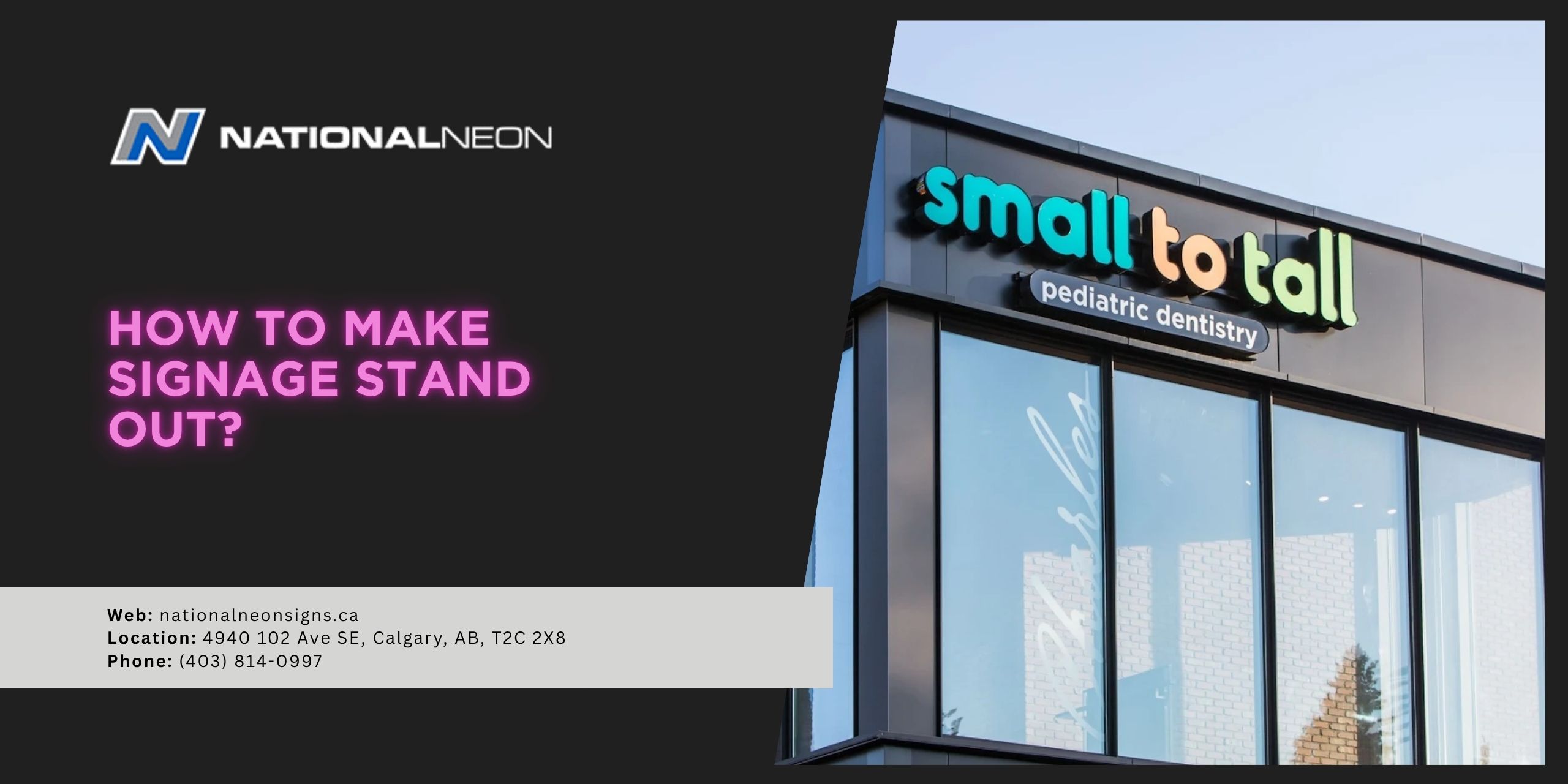
- Channel Letter Signs: These signs feature individually crafted three-dimensional letters that are internally lit. Businesses can choose from front-lit, back-lit, or combination-lit channel letters, depending on the look they want to achieve.
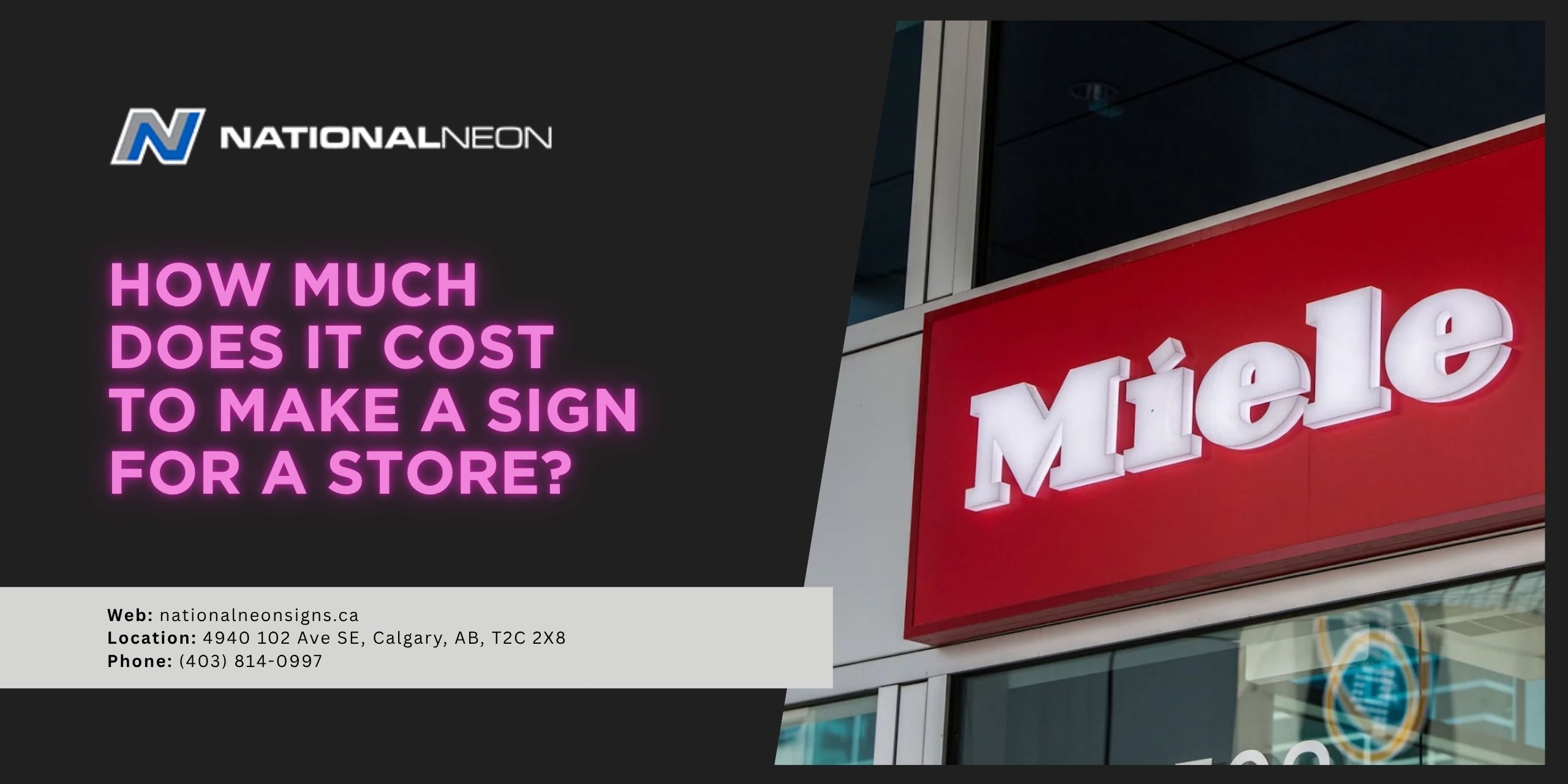
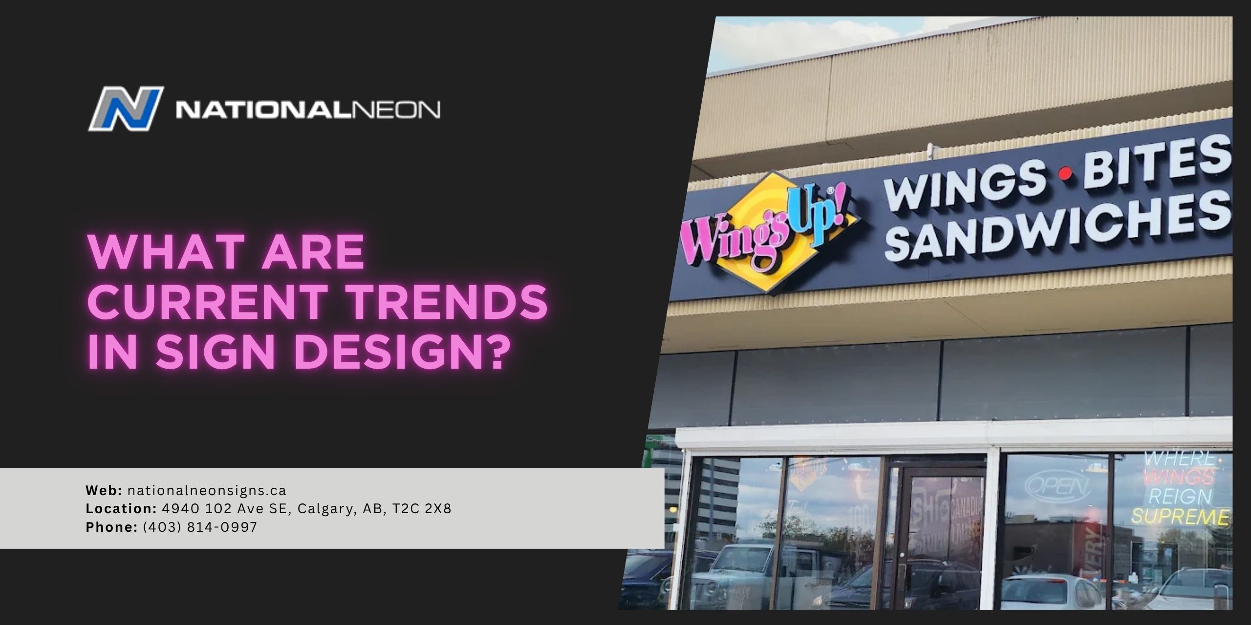
- Cabinet Signs: Illuminated cabinet signs, sometimes called box signs, contain internal lighting behind a translucent panel. The entire face of the sign lights up, making it easy to see both day and night.
- Digital Signs: Digital LED displays allow businesses to update their messages instantly or rotate between different promotions and announcements. Some digital screens include interactive features like QR codes or touchscreen capabilities. These features are designed to engage customers and leave a lasting impression.
- Neon Signs: Traditional neon signs are made using handcrafted glass tubes filled with gases such as neon or argon, which produce a bright, glowing effect when electrified. Because of their vibrant colours and nostalgic appeal, neon signs have experienced a major resurgence in popularity, particularly among businesses looking to create a retro atmosphere. Today, many modern neon-style signs are created using flexible LED tubing to create the classic neon look. However, authentic neon signs do exist and remain valued for their distinctive craftsmanship.
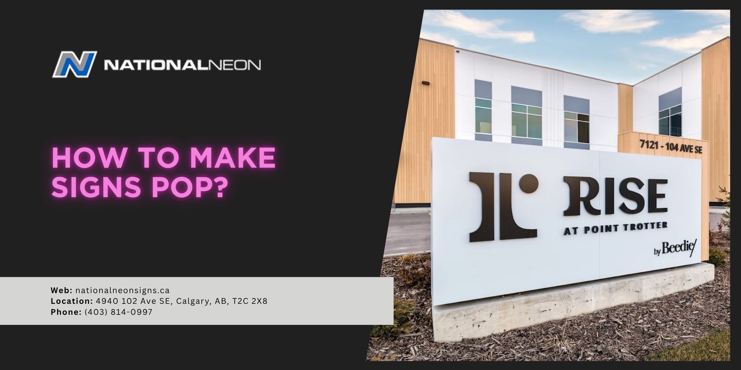
- Monument Signs: Many commercial properties use illuminated, freestanding signs near entrances to enhance visibility from the road, especially at night.
What are the benefits of illuminated signage?
Illuminated signs provide several advantages for businesses of all sizes, including:
- Increased Visibility: One of the biggest benefits of illuminated signage is improved visibility. Lighted signs are easier to see during nighttime hours or poor weather conditions, helping businesses remain noticeable 24/7.
- Stronger Brand Recognition: A bright, professionally designed illuminated sign naturally attracts attention, helping customers notice and remember a company’s name, logo, colours, and overall branding.
- Professional Appearance: A high-quality illuminated sign helps create a polished, professional appearance and can elevate the overall appearance of a business property. Many companies use illuminated signs to create a more modern, welcoming look that builds customer confidence.
- Customization: Illuminated signs are available in a wide variety of styles, colours, materials, and different lighting effects, so businesses can customize their signage to match their branding.
- Energy Efficiency: LED signage is highly energy efficient and durable, reducing both operating and maintenance costs.
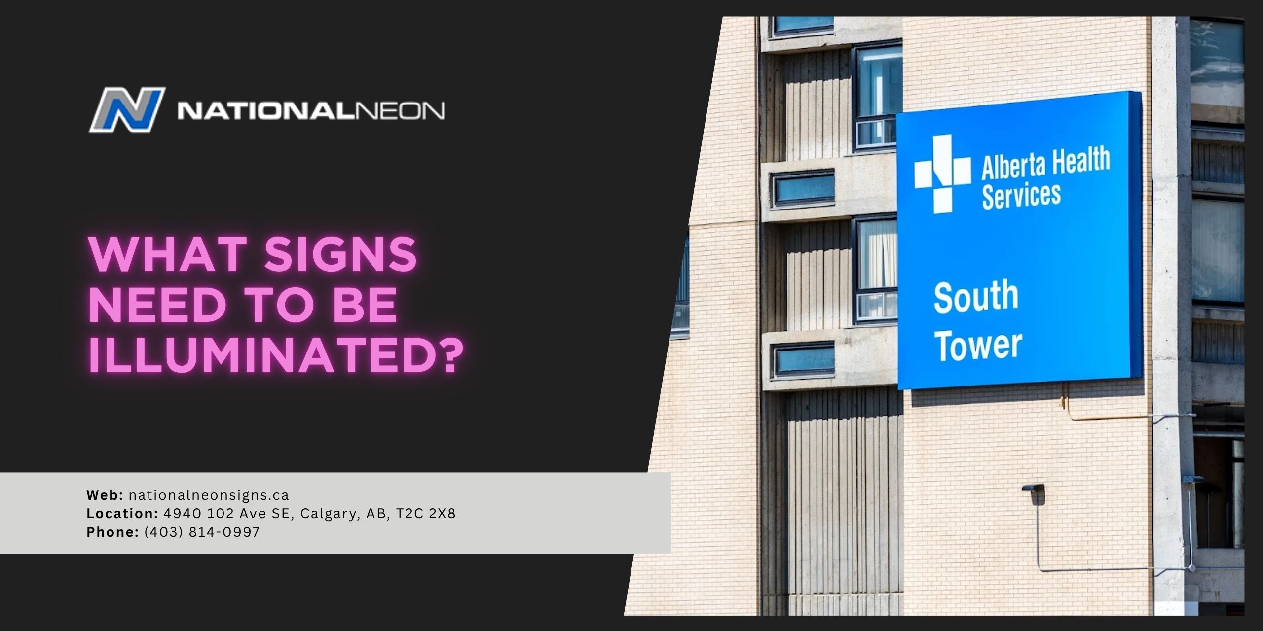
Do I have to illuminate my sign?
No, you don’t have to illuminate your sign, and whether or not your sign needs lighting might depend on business hours, location visibility, branding goals, or local regulations. Non-illuminated signs remain popular for many businesses, particularly those looking for a simple, cost-effective option. While these signs can still be highly effective, they do have certain drawbacks, particularly their limited visibility after dark.
Illuminated signage is more than just a way to display your business name – it’s a powerful tool to help attract attention and create a lasting impression both day and night. For more information, contact us today at National Neon!