When designing your channel letter sign, you’ll have a lot of decisions to make: colours, size, and lighting styles all influence the effectiveness of your sign. The font you choose matters just as much as any of these factors! Choosing the right font improves readability, enhances brand recognition, and ensures your sign looks great both night and day. On the other hand, the wrong font can make your sign hard for viewers to read.
So what is the best font for channel letters? That depends on your business’s brand and style, but generally, the best fonts for channel letters are bold, clean, sans-serif types. In this post, we’re going to take a look at the most widely recommended fonts for channel letter signs and why choosing the right font is so important.
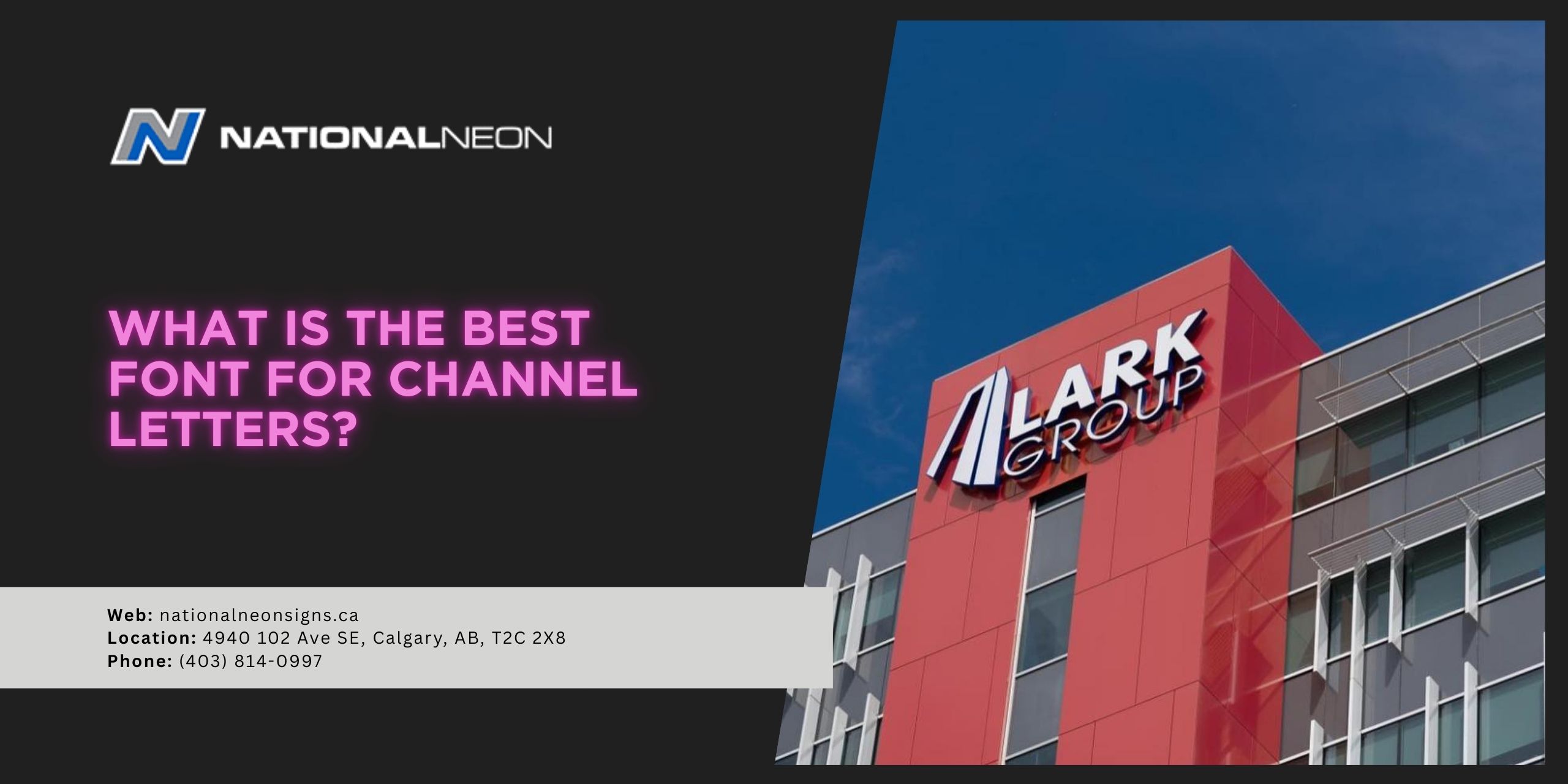
What are channel letters?
Channel letters are three-dimensional, individually crafted letters, commonly used as storefront signage. Each letter is its own unit with a metal body and an acrylic face, typically illuminated using energy-efficient LED lighting.
Channel letters are a popular choice amongst a wide variety of businesses due to their high visibility, durability, and professional appearance.
What is the best font for channel letters?
The best fonts for channel letters are those that are bold and easy to read, featuring clean lines, simple letter shapes, and wide, even strokes. Sans-serif style fonts (literally meaning “without serifs” or “without decorative strokes”) are highly recommended.
Here are some of our top recommended fonts for channel letter signs:
- Helvetica: A timeless, neutral, highly legible classic.
- Futura Bold: Geometric, clean, and modern.
- Arial or Arial Black: Simple and universally recognized with strong, heavy strokes.
- Franklin Gothic: Contemporary and bold, great for distance viewing.
- Verdana: Friendly and approachable, yet still easy to read.
- Montserrat: Popular for its modern, geometric, friendly appearance.
Some serif fonts can still work when used with caution:
- Palatino Bold: Elegant and classic, works well for upscale businesses.
- Copperplate: Uses uniform, heavy strokes to communicate authority and professionalism.
- Rockwell: A bold slab serif that has a strong, retro feel.
- Baskerville: A traditional serif with strong vertical strokes, feels classic and refined.
Why does font choice matter for channel letters?
The right font choice is crucial for channel letters because it directly impacts readability, visibility, and brand identity. Remember, channel letters are three-dimensional signs and are often illuminated. This means fonts will appear differently than those on a flat graphic, like a screen or business card. Thin strokes, tight spacing, or overly decorative details might look good on paper, but can be hard to read or cause uneven lighting on a channel letter sign.
Here are a few reasons why font choice really matters:
- Readability: The primary function of a channel letter sign is to convey a message quickly and clearly, often by people driving or walking by. Bold, simple fonts stay legible, even at long distances.
- Lighting: Many channel letter signs are illuminated for higher visibility, even after dark. Thin or overly detailed fonts can cause dim, uneven lighting, create dark spots, or cause glare. Fonts with even, wide strokes distribute light better and work well with different lighting styles, including front-lit or halo-lit effects.
- Fabrication: The physical nature of channel letters makes some fonts more challenging (and costly) to manufacture than others. Thin letter strokes or intricate details can be extremely difficult to fabricate and ultimately affect the sign’s legibility.
- Brand Perception: The font you choose affects the way viewers perceive your overall brand and values – sometimes before they even read the words. A clean, sans-serif font comes across as modern, professional, and efficient, whereas a serif type font gives off a more traditional, upscale feel.
- Compliance: Local signage bylaws or ordinances often require certain letter heights or legibility standards, and some fonts may not meet those requirements. Always check your local regulations before designing channel letter signage.
The best font for your business is the one that’s clear and easy to read while staying true to your brand. For more information on channel letter signs, contact us today at National Neon!