Your storefront sign has a big job to do. It needs to communicate your brand, attract attention and help customers find your business quickly. In many cases, your signage is your business’s first impression. Today, we live in a world with countless signs, advertisements and distractions competing for our attention and a poorly designed sign can easily be overlooked.
So how do you make your signage stand out? Effective storefront signage should be easy to see, easy to read, and memorable enough that people notice it as they walk or drive by. In this post, we’ll explore a few simple ways to enhance your signage so it stands out and works harder for you.
How to make signage stand out?
A noticeable business sign typically uses strong colour contrast, clear lettering and adequate size. Lighting and dimensional elements can also help a sign attract attention, especially from a distance. Let’s take a look at these strategies in more detail:
1. High Contrast Colours
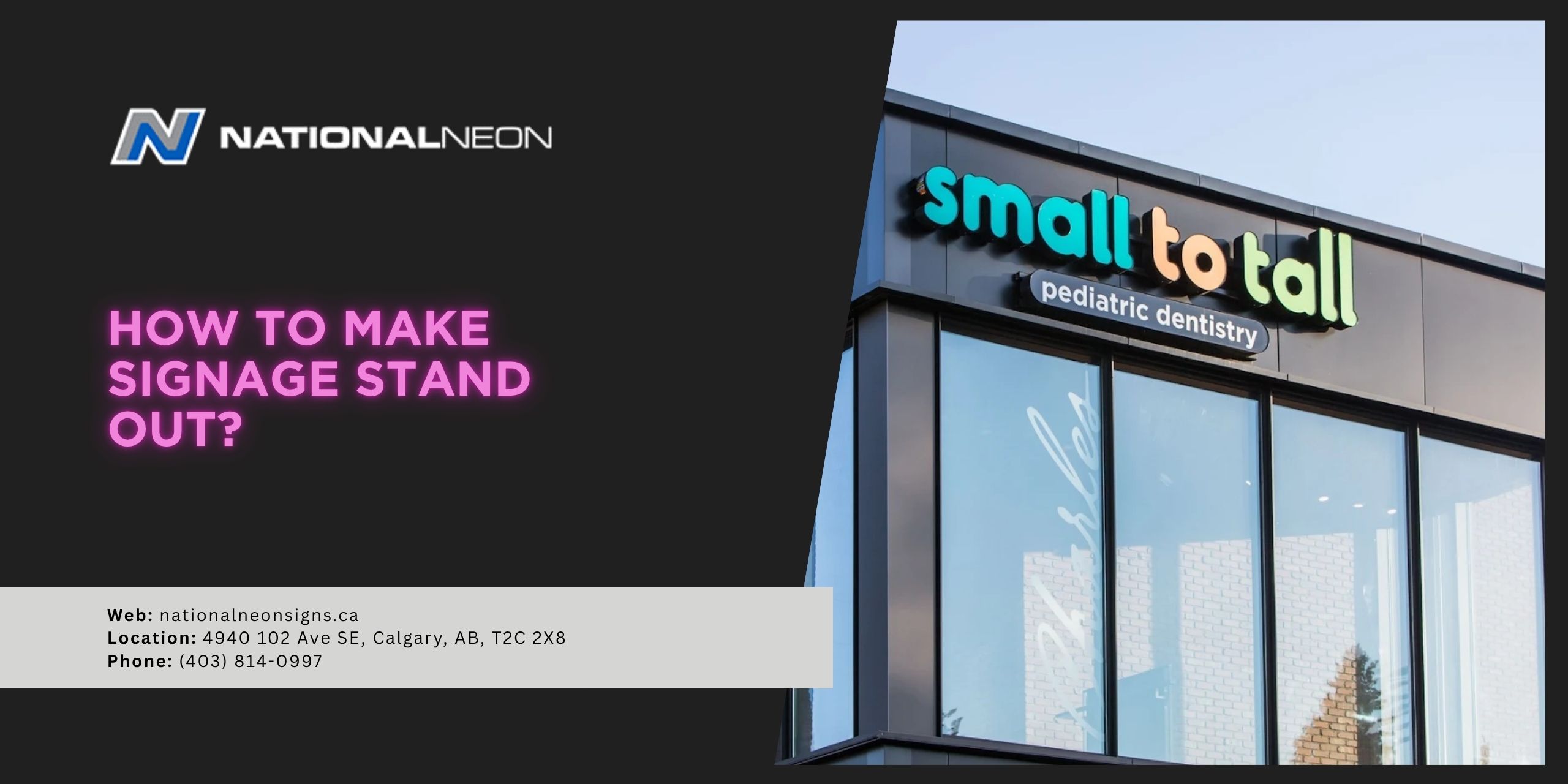
Signs that pop often use a strong contrast between the background and the lettering. For example:
- Black letters on a light background
- White letters on a dark background
- Bright colours, contrasting colours (blue and yellow, red and yellow, teal and orange, etc.)
High contrast colours make signs easier to see and read, especially from a distance.
2. Clear Lettering
Choose clear, bold fonts to make signage easy to read and recognize at a glance. Sans-serif fonts are commonly used for storefront signage because they remain legible from a distance. Fancy, decorative fonts may look interesting, but they often become difficult to read from far away. If someone has to pause to figure out what your letters say, your sign has already lost its effectiveness.
3. Letter Size
When it comes to lettering, size matters. The larger your letters, the easier it is for people to see and read your sign from a distance. Before designing your sign, think about how far people will be when they see it. Will they be walking down the sidewalk, or driving past from a busy road? The distance and speed of passing traffic will have a big impact on how large your letters need to be.
As a general guideline, each inch of letter height provides about 10 feet of readable distance. This means a 12-inch-tall letter can be read from roughly 120 feet away, which works well for pedestrians or slow-moving traffic. For vehicles moving at highway speeds, letters often need to be 18 to 24 inches tall or more to be read quickly and safely from the same distance.
4. Illumination
Lighting can dramatically increase the visibility of your signage. Even the most well-designed lettering can blend in when the lighting is poor, but illumination makes your sign easy to see at night, on cloudy days, or during the winter months when daylight hours are limited. There are a lot of lighting options to help your signage stand out, including:
- LED channel letters
- Backlit letters or logos
- Halo-lit letters
- Spotlights/Gooseneck lighting
- Front-lit cabinet signs
- LED digital signs
Illumination is almost always worth the investment, keeping your business visible around the clock.
5. Add Depth and Dimension
Flat signage works well, but adding depth often draws more attention. Dimensional letters, such as channel letters, rise off the wall and create natural shadows that draw the eye. Layered logos or lettering add texture and contrast, which makes your storefront feel more polished and professional. Even subtle depth can significantly improve visibility, making your business more memorable for passersby.
Should a storefront sign include a lot of information?
Generally, no. The main goal for your storefront sign is to grab attention quickly and communicate your business at a glance. Too much text or information can overwhelm viewers and make your sign harder to read, especially for people walking or driving by.
A good rule of thumb is to focus on the essentials, including:
- Business name
- Logo or brand icon
- Short descriptor (optional)
Anything beyond that can make your sign feel cluttered and reduce its impact. Remember, less is more.
Ready to create a sign that stands out in the crowd? Contact us today at National Neon Signs!