Wayfinding in complex public spaces can be a challenge. Poorly designed wayfinding can lead to stress, confusion, and ultimately a poor user experience. Imagine arriving at an airport with no clear signs leading to the baggage claim, security checkpoint, or departure gate. You’d probably miss your flight! On the other hand, strategically placed wayfinding signage creates a clear path so visitors can quickly and easily navigate through an unfamiliar environment.
As a business owner, you want your customers to have a positive experience as they make their way through your facility. But how do you create effective wayfinding signage? This might look different for each business and requires a deep understanding of user behaviour and the physical environment. Signage needs to be highly visible, strategically placed, clear, consistent, and universally understood.
In this article, we’re going to learn how to create and place effective wayfinding signage to guide visitors seamlessly through your space.
What is Wayfinding Signage?
Wayfinding signage is a system of visual cues and navigational aids designed to guide people through complex environments and convey other important information. Signage might include maps, arrows, symbols, text and colours to help orient visitors in an unfamiliar setting.
There are four main types of wayfinding signage:
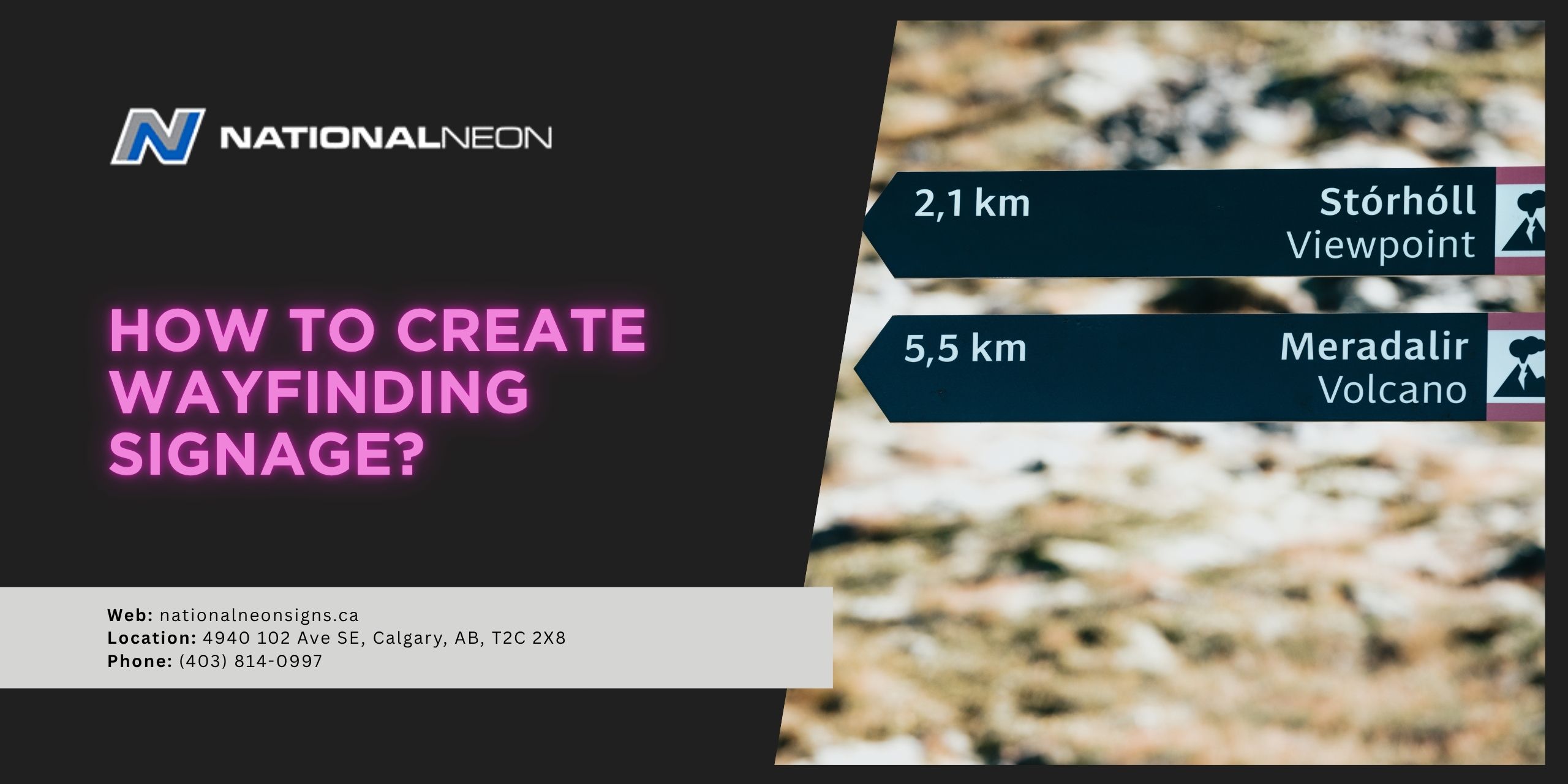
- Directional Signs: Point people in the right direction for their destination
- Identification Signs: Label rooms or other points of interest
- Informational Signs: Provide general information about a facility
- Regulatory Signs: Communicate rules, restrictions, or other safety protocols
Together, these signs help visitors navigate easily, enhancing their experience and reducing confusion.
How to Create Wayfinding Signage?
To create effective wayfinding signage, first plan the system by mapping user journeys and identifying key decision points. Next, design the signs with clear, concise, consistent branding, using legible fonts and universally understood symbols. Finally, strategically place the signs where they are highly visible and accessible for maximum visibility. Plan for regular maintenance to ensure the signage remains functional over time.
Let’s look at these steps in more detail:
1. Plan and Map the User Journey
- Analyze the Environment: Walk through the space, considering the typical journeys that users will likely take, identifying key “decision points”, such as junctions, intersections, entryways, or stairwells.
- Map the Environment: Map out the physical layout of the entire space, including important destinations like exits, washrooms, and elevators. Trace the paths users will likely use from entry to their final destination to help determine where signage is most needed.
- Consider Accessibility: To ensure inclusivity, design wayfinding signage with all users in mind, including those with disabilities.
2. Design the Signs
- Prioritize Clarity: Use simple, clear, concise language, avoiding jargon. Use legible fonts and minimal text to ensure quick comprehension.
- Ensure High-Visibility: Choose high-contrast colours for the text and background (for example, black text on a yellow background) so your sign is easily readable, even from a distance. Make sure your sign is well-lit and appropriately sized.
- Maintain Consistency: Maintain a consistent design across all signs, including colour, typography, iconography, and sign shapes. This helps create a professional, cohesive system, builds user confidence, and reinforces branding.
- Use Universal Symbols: Incorporate standard, internationally recognized symbols for things like washrooms or exits to avoid confusion and overcome language barriers.
- Use Arrows Effectively: Arrows should be large, clear, and point away from the text.
3. Place the Signs
- Implement Signs Strategically: Place signs at key decision points. These are places where users need to make a choice when navigating through a space, including junctions or destinations like washrooms, elevators, or exits.
- Place at Eye Level: Position signs at eye level, where they are easy to see.
- Consider Lighting: Test the signage in different lighting conditions. When necessary, use reflective or illuminated materials for better visibility in low-light conditions.
4. Testing and Maintenance
- Create Mockups: Before mass production, create and test prototypes to ensure they are easy to understand. Incorporate user feedback to make any necessary adjustments to the design or placement of the signs.
- Schedule Maintenance: Plan for regular cleaning, repairs, and system checks to ensure the signage remains in good condition.
National Neon Signs, a reliable signage maker in Calgary, specializes in creating custom wayfinding signage tailored to the unique requirements of businesses. Contact us today for more information!