Designing wayfinding signage is about so much more than just creating attractive signs – it’s about shaping an entire experience. Clear, strategically placed wayfinding signage helps visitors move quickly and confidently through a space. On the other hand, poorly designed or inconsistent signage has the opposite effect.
As a business owner, you want your customers to feel good about their experience during their visit to your facility. So how do you design effective wayfinding signage? This will look a little different for each business. It requires an understanding of how users might navigate through your space, combined with the core principles of wayfinding signage, clarity, consistency, and visibility.
In this post, we’re going to discuss how to design wayfinding signage that works.
What are the core principles of wayfinding signage?
The core principles of wayfinding signage are clarity, consistency, and visibility. These are the fundamental guidelines that make a wayfinding system clear, intuitive, and effective, and are absolutely essential when designing your signage.
Let’s take a closer look at each principle:
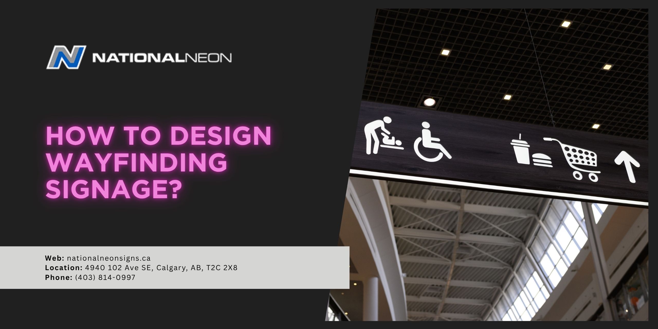
- Clarity: Signs should use clear, concise language with legible fonts and universal symbols.
- Consistency: All signs within a location should follow a unified system: They should share the same colour palette, fonts, and layouts for a cohesive, predictable user experience. Labels and terminology should remain consistent throughout the facility. For example, calling the same floor “Level 2” on one sign and “Level B” on another can cause confusion and mistrust in the system.
- Visibility: Signage should be appropriately sized, well-lit, and highly visible, even from a distance. Use high-contrast colours to improve readability, for example, dark-coloured text on a light-coloured background.
How to design wayfinding signage?
Designing effective wayfinding signage starts with an understanding of how people navigate through a space. First, you must plan the system by observing how people naturally move through your facility and identifying key decision points. Next, create your signs using a clear information hierarchy, prioritizing the key principles, and place them strategically throughout your facility. Finally, before final production, test and iterate the samples in a real-time environment to ensure they work as intended.
Let’s take a look at these steps in a bit more detail:
1. Start With Understanding Your Space
This step is handled by professional signmakers in Calgary, but before thinking about colours and fonts, it’s important to understand your space and how people naturally move through it. Walk through the area and identify key paths, decision points, and primary destinations. Keep accessibility in mind, your signage should be clear, inclusive, and usable for everyone, including people with disabilities.
2. Build a Clear Information Hierarchy
Wayfinding signage relies on a hierarchy that structures information in a logical order, from the most important to the most specific.
- Primary signage gives people the broadest, essential information they need first. These are the largest, most prominent signs that guide users to major destinations and help them understand the overall layout.
- Secondary signage helps guide people toward specific zones or amenities after they’ve already oriented themselves within a high-level destination. These signs are smaller than primary signage and usually appear at key decision points.
- Tertiary signage identifies exact rooms or locations. They are the smallest, most specific signs that confirm a user has arrived at their destination, rather than pointing them in a direction.
3. Create Your Signs
Design your signs with the core principles of wayfinding signage in mind: clarity, consistency, and visibility. Keep information brief and to the point, use universal signs and symbols, and ensure all arrows are large, clear, unambiguous, and pointing away from the text. Remember, users should be able to understand your message within seconds! When designing your signs, you can choose fonts, colours, shapes, and logos that fit your brand’s aesthetic while still prioritizing functionality.
4. Strategically Place Your Signs
Place your signs at (or just before) all key decision points, junctions, destinations, or paths that you discovered during your initial walkabout. When possible, signs should be installed at eye level.
5. Test and Iterate
Finally, create samples and test your signage. Try walking through your space as though you’ve never been there, or ask test users to navigate your facility using your signs. Watch closely to check for confusion or hesitation and adjust your signage as needed. Real-world behaviour can always highlight issues that design alone can’t predict!
Ready to design wayfinding signage for your business? Contact us today at National Neon.