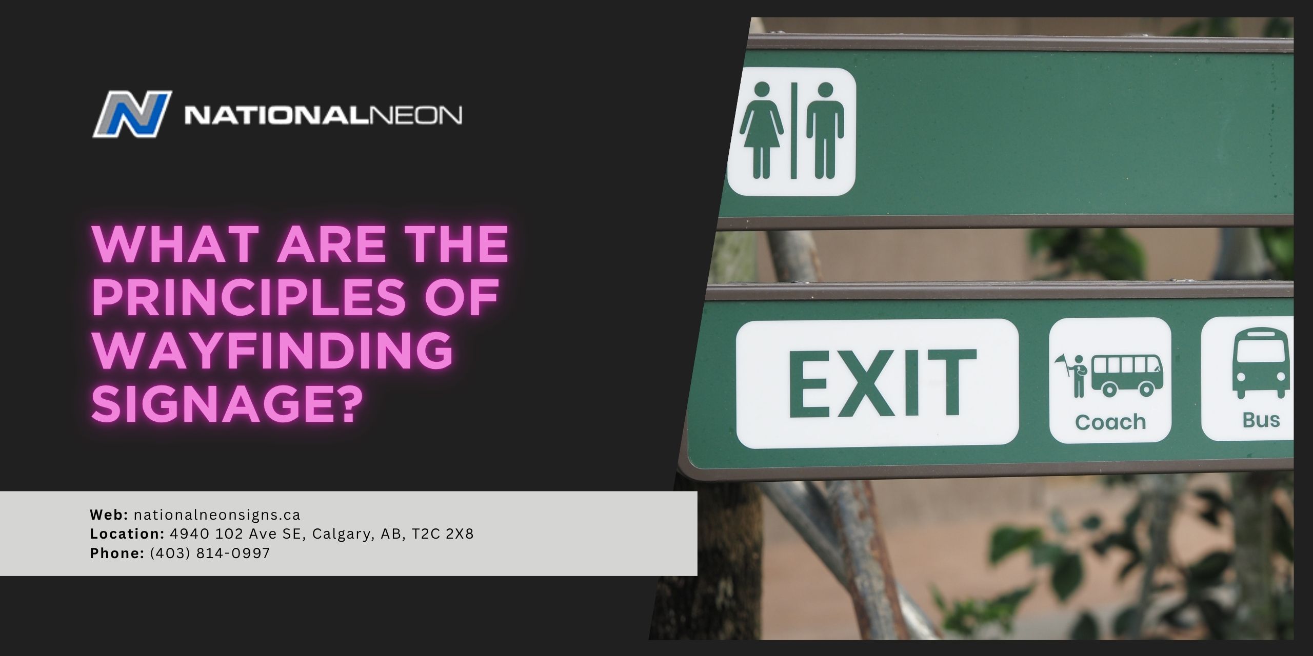
Wayfinding signage plays a crucial role in helping people navigate complex environments with confidence. When signage is well-designed, most people don’t even notice it – it simply guides them from point A to point B with ease.
Now, imagine trying to navigate through a busy airport with no clear signage directing you to the security checkpoints, terminals, or baggage claim: You’d likely be stressed, frustrated, and you might even miss your plane! This is what happens when signage is missing, confusing, or inconsistent. Understanding the core principles behind wayfinding signage can help business owners and property managers create spaces that feel organized and intuitive, enhancing the overall user experience.
In this post, we’ll explore the essential principles of wayfinding signage and why they matter.
What are the principles of wayfinding signage?
Principles of wayfinding signage focus on making navigation intuitive through clarity, consistency, visibility, accessibility, and simplicity. Signs should be universally understood and placed strategically to create a seamless journey from start to finish. Supporting elements include a clear hierarchy that’s integrated with branding and aesthetics. When you work with a professional signage company in Calgary, these details are typically handled for you. Let’s take a closer look at these principles.
1. Clarity
Signs should use simple, concise language with legible fonts and universal symbols. Ideally, people should be able to understand a sign within seconds.
2. Consistency
All signs within a location should follow a unified system. They should use the same colours, fonts, and layouts for a cohesive, predictable user experience. Wayfinding signage works best when every sign looks like it belongs to the same “family”.
3. Visibility
Wayfinding signage should be appropriately sized and highly visible, even from a distance. High-contrast colours can improve readability (for example, black text on a yellow background), and proper lighting should be used to ensure your signage remains effective in various conditions.
4. Accessibility
Signage should be accessible and inclusive to all users, including those with disabilities. Some features might include Braille, tactile lettering, audio cues, and signs positioned at an appropriate height for wheelchair users. Accessible wayfinding shows respect for all visitors and reduces potential barriers for movement.
5. Simplicity
Information on wayfinding signage should be brief and to the point, giving users exactly the information they need to know, no more and no less. Too much text or too many symbols can look cluttered or feel overwhelming. A simple, streamlined message is far more effective than an overly detailed one!
6. Strategic Placement
Signs should be placed at eye level and should appear at every “key decision point” – where a visitor must decide which direction to go. This might include at intersections, elevators, stairwells, entrances, or lobbies. Placing signage just before the visitor arrives at these points gives them enough time to adjust their path without stopping or slowing down, keeping traffic flowing smoothly. “Reassurance” signage is also helpful, letting visitors know they are headed in the right direction.
7. Information Hierarchy
Wayfinding requires a hierarchy that structures information in a logical order, so users can quickly understand what’s most important and what they need to do next. It organizes information from broad, essential information to more specific, localized information. Primary signs guide users to major destinations, secondary signs direct them towards specific zones or amenities, and tertiary signs identify exact rooms or locations. This layered structure reduces confusion and ensures visitors receive the right information at the right time.
8. Branding and Aesthetics
Wayfinding signage can be used to support the company’s identity and general aesthetic – without sacrificing clarity or functionality. By incorporating the company’s colour palette, typography, or logo, signage can create a cohesive experience that naturally reinforces branding for every visitor.
Why does wayfinding signage matter?
Wayfinding signage from a professional sign company matters because it helps people move through a space confidently and efficiently. It reduces stress and confusion, enhances safety, and improves operational efficiency. By following the core principles of wayfinding signage – including clarity, consistency, accessibility, and thoughtful placement – businesses can create an environment that feels welcoming, organized, and easy to navigate.
Wayfinding is about so much more than just signs! It’s about building a space that reflects your brand by making every person who walks through your door feel comfortable. For more information, contact us today at National Neon.